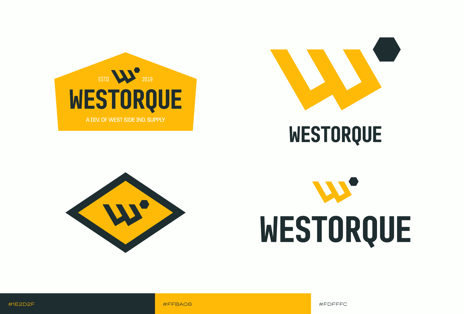
Updated Identity for Westorque
I was contacted by Mike Conway about updating the logo for Westorque, an online branch of the tool distribution company, West Side Industrial Supply. Mike expressed that, while his Canva-designed logo was good enough, he wanted something more unique to Westorque instead of something from Canva assets accessible by anybody.
Working together with Mike on a Pinterest board got us on the same page of the desired visual direction. The board was primarily made up of industrial branding that featured strong, prominent icons, with a heavy focus on letter marks as the primary visual. It was clear, too, that Mike felt inspired by a vintage style.
With these in mind, I got to sketching and focused on creating something that felt clearly industrial, and would, hopefully, stand the test of time like some of the great vintage brands on the Pinterest board. I worked on finding ways to symbolize “torque,” attempting to fit in the symbol for torque, or use a hexagon, the shape of a bolt head, to guide the design.
Inspired by history
West Side Industrial & Electric Supply, a family business started by Mike’s grandfather in 1978 and now headed by his father and uncles, has a pretty rich visual history. I felt compelled to draw on West Side’s two primary logos, pictured here, to inform the direction of Westorque’s new identity.
Yellow and black are a strong color combination that we see across construction and industrial supply. Considering that and its historical use in the color palette for West Side, it felt right to utilize it for Westorque. I also loved the asymmetry of the rounded W that the fox is leaning on, and was able to mirror that weight in the final iteration of the logo.
The final logo suite honors the history of Westorque’s parent company, West Side, while creating an identity that is unique to Westorque. The hexagon is both an allusion to torque, and an homage to the rounded, asymmetrical W in West Side’s early logo. The leftward lean of the W is the idea of the mark pointing towards the west. Finally, the color palette is a modernization of the West Side palette. The yellow has a bit more richness to it, and, because Westorque is an online service, the shade of black is informed by web design best practices of using a shade of black a bit lighter than pure, 100% black.

